● Identity · Theatre
Garance
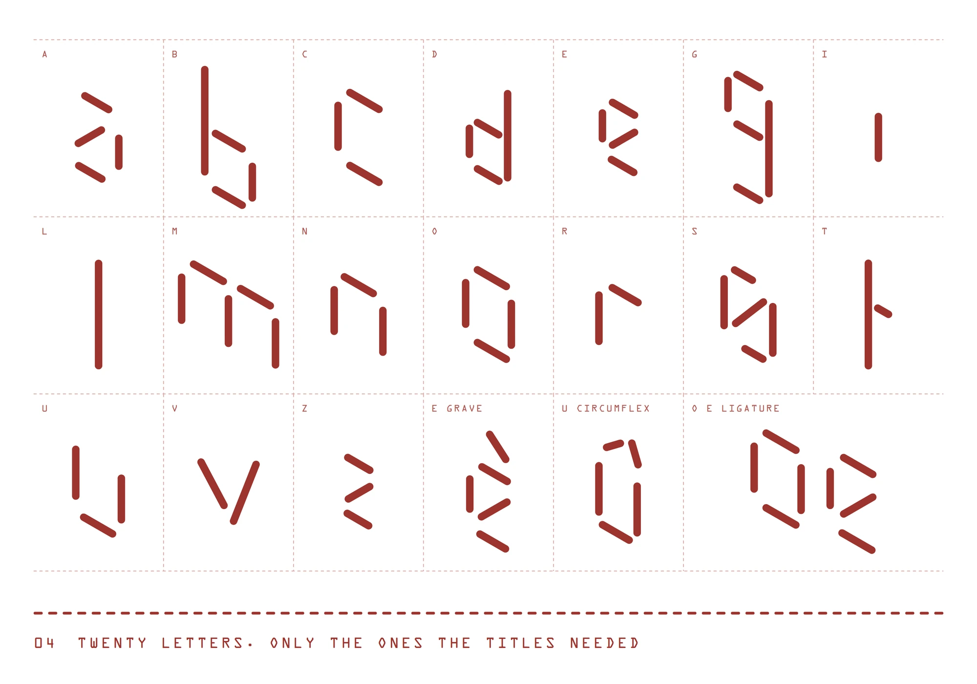
A theatre identity, sewn stitch by stitch. Identity for La Garance, the national theatre of Cavaillon. Garance is the French word for madder, the plant whose root dyes cloth red, so every letter is drawn in stitches.
- Client
- School brief, ECV Aix-en-Provence
- Role
- Identity and motion
- Subject
- La Garance, Scène nationale de Cavaillon
- With
- Noémie Martin
- Deliverables
- Lettering, posters with tear-off tickets, social announcement
- Years
- 2016
- Status
- Student project
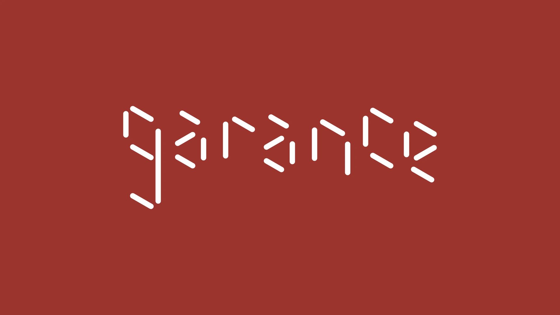
From the name to the stitch
- 01The name
- 02The stitch
- 03The colour
The rule
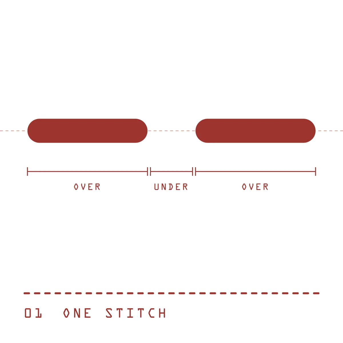
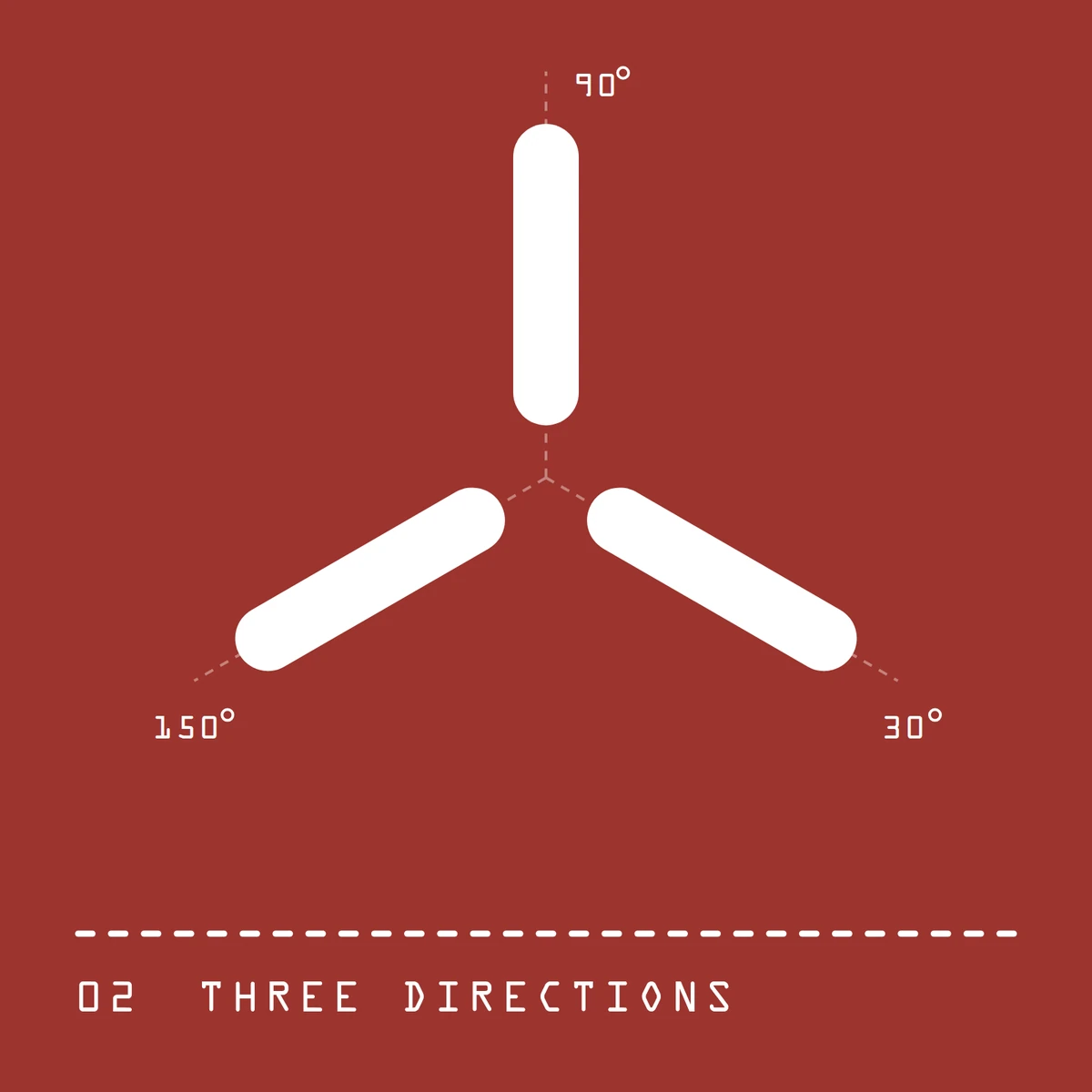
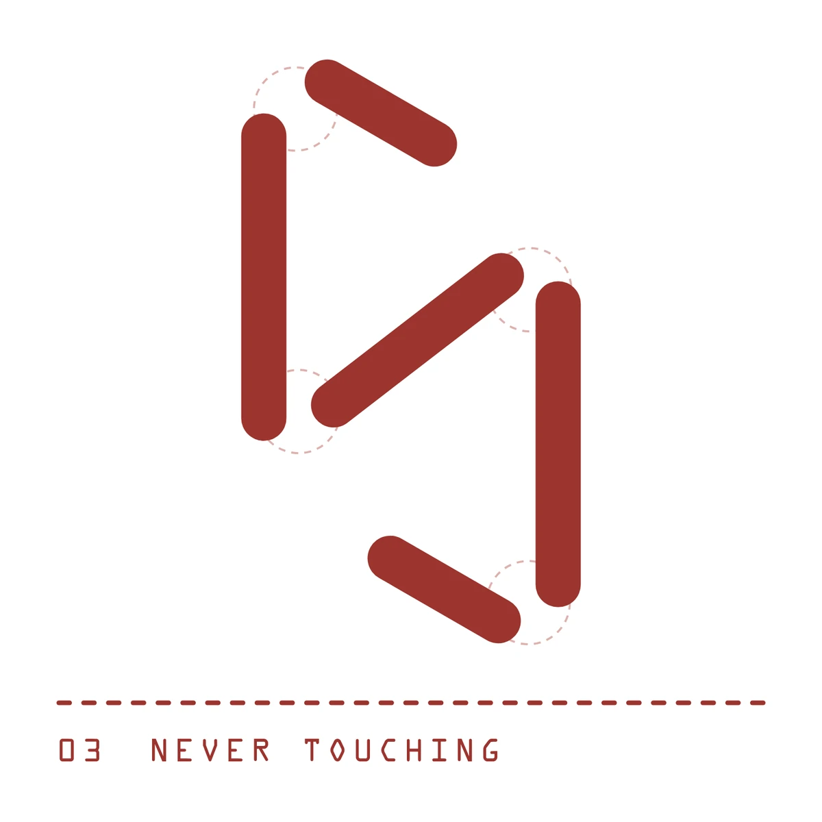
Three rules, measured on the drawings.
Across the mark and the two poster titles, 174 strokes share one weight and never touch. Almost all of them follow three directions; the v, the s and the accents step outside.
Posters
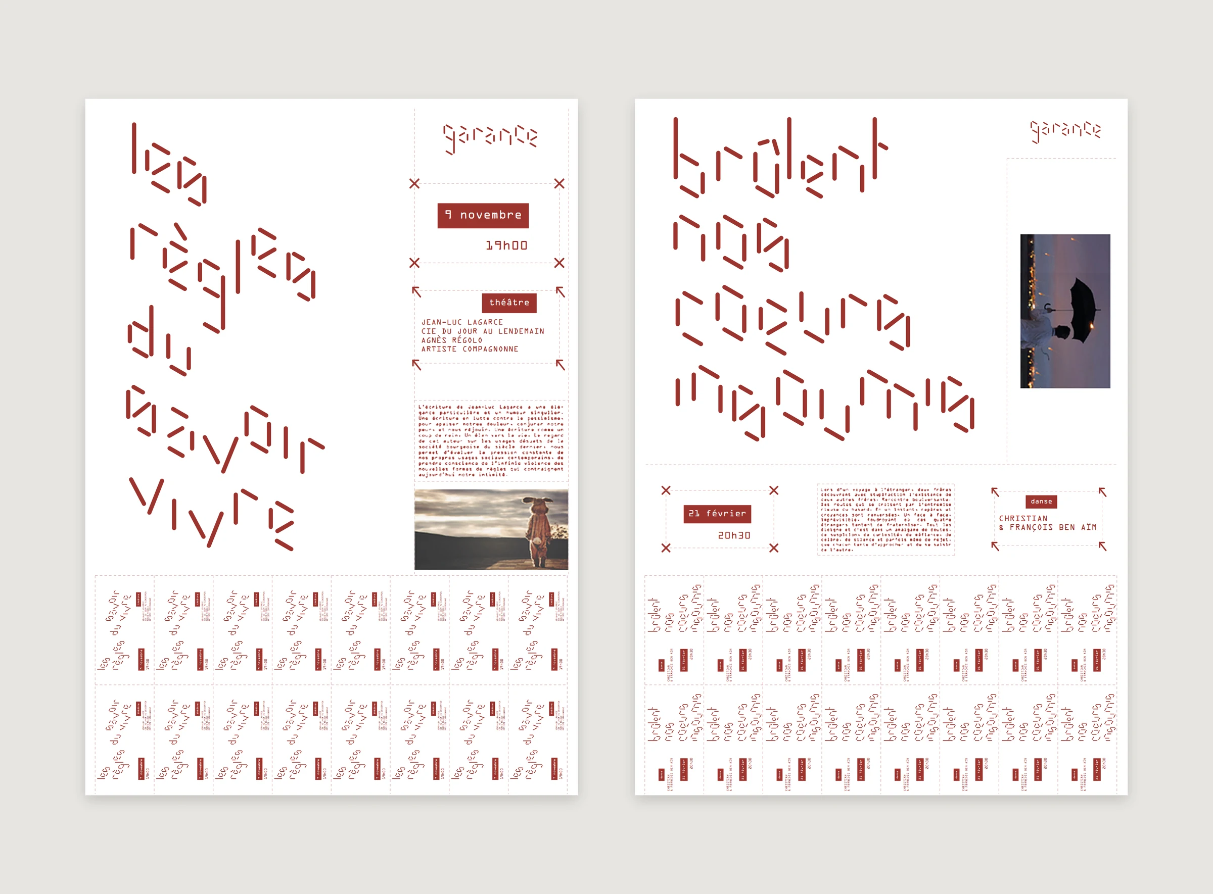
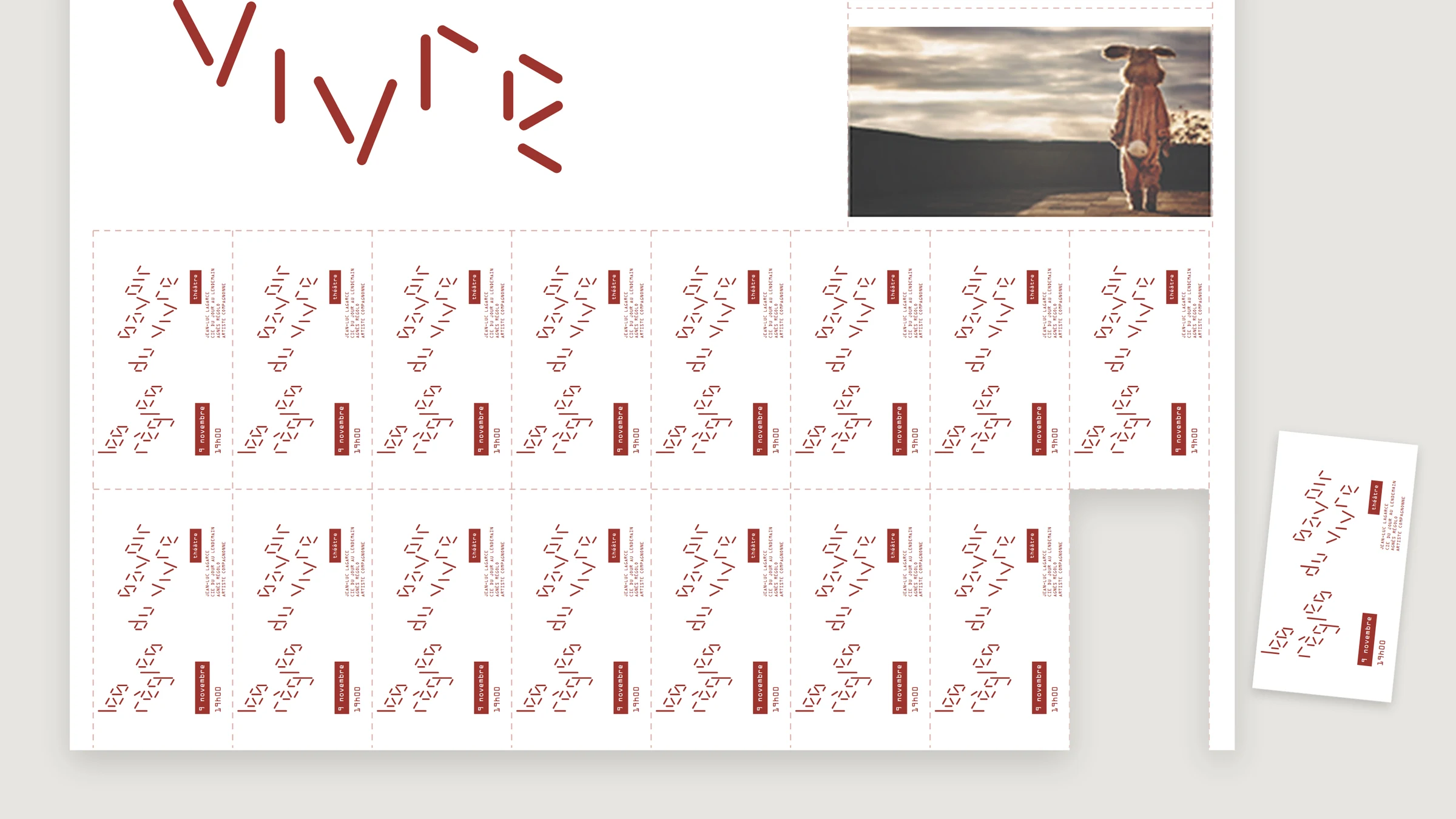
A poster that gives its tickets away.
Each show gets a poster. Its lower third is a sheet of tickets: the title, the date and the company, repeated sixteen times, each one cut out along a stitched line.
Information sits in two kinds of frame: crosses for when, arrows for what and who. The companion typeface is OCR-A, a face designed to be read by machines, set against lettering that looks made by hand.
In motion
The announcement, sewn in front of you.
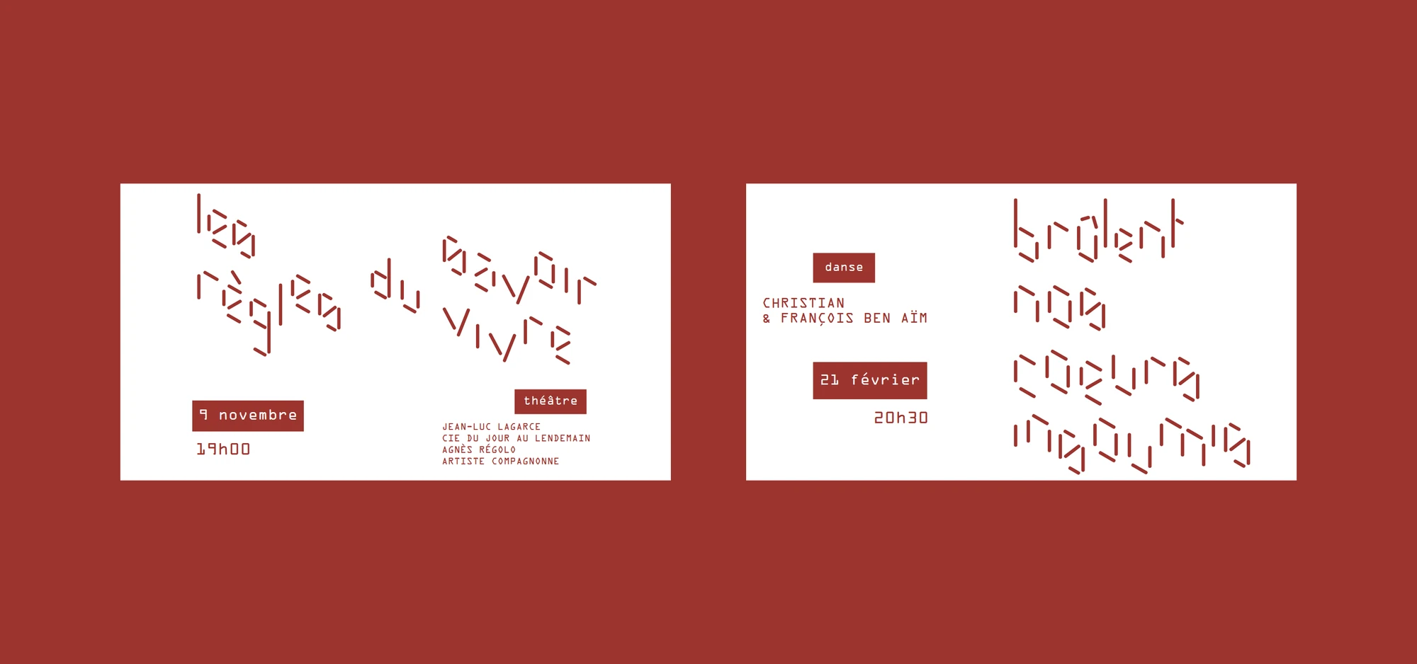
The brief asked how a show would be announced on social networks. The title arrives one word at a time, and every word is made from the strokes of the one before: they turn and slide like needles. The photograph opens in bands, the date and the hour roll into place, then the strokes of the title gather into the mark.
The lettering, posters and tickets are the 2016 work, redrawn in vector. The animation was rebuilt in 2026 on the same rules.